Category bar
 |
Summary:
|
Java
Related design guidelines |
Sometimes there are more functionalities than can comfortably fit into one screen. In such cases it should be easy to navigate between the related functionalities, such as making a call by different means (using contacts list or by dialling), without navigating a deep menu tree of separated apps. Also, there might be more modes or views of the same application, when navigation between them needs to be simple.
- A category bar may be used to allow visibility and navigation between:
- Different sub-apps,
- functionalities, or
- modes within an app.
- Category bar is level contextual; it disappears when user drills down, or is replaced with a new category bar.
- Category bar functionality can be compared to tabs.
- Category bar is not suited for representing actions.
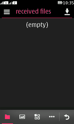
- Category bar is shown in both orientations, and always appears at the bottom of the screen with back button on the right most location.
- Users change the active category by tapping on the category icon.
- Currently active category is highlighted using the accent colour (unless Branding is applied).
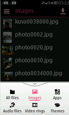
- The text label for categories is not shown in the category bar in the default state. Text labels are only shown when the category bar is expanded.
- The text label for categories is displayed:
- In the header bar when the category is selected.
- In the category bar's expanded view.
- Horizontal scrolling should not be used in views with a category bar; the primary scrolling direction is vertical.
Category bar's expanded view
Apps should preferably not have more than four categories. In case more categories are needed than fit to the screen, a 'more' button is automatically added.
- By tapping 'more' the bar expands, showing all the available categories with the corresponding labels.
- The background is dimmed when the category bar is expanded.
- The expanded view collapses by tapping outside the bar, by dragging it down, or when selecting one of the available categories.
The maximum number of visible categories is 4 (or 3 + more) in portrait mode and 6 (or 5 + more) in landscape mode.


Category bar icons
The Category bar icon canvas is 20 x 20px. The bounding box is 36 x 36px. Please refer to the Nokia icon toolkit for some ready-made Category bar icons.